CURSE NEGATIVE
-> A CSS template by @JustCallMeJJ on Janitor AI for Janitor AI
Template taken aesthetic insperation from Fatal Frame + PS1 early 2000s Japanese style horror games!
Tables of Content
BOUNDARIES AND DISCLAIMERS
All of the CSS coding is written by me (@JustCallMeJJ).
If you use any of my templates, PLEASE credit me properly, I spent time learning and writing the CSS codes. If you don't credit me I will crash out and cry.
"JJ, what do you mean by crediting you properly?
Make sure to add a hyperlink that mentions me and my page along with the link to my profile. Don't make it so transparent you can barely see it, don't make the font too small, don't try. to. hide. it.
"JJ! Some elements are broken!"
Leave a comment under the bot of where you found the template and I'll get it fixed as quick as I can.
"JJ, how do I use this template?"
Go to your profile, press the color pallet icon, and you'll see a menu pop up at the bottom. Press the cogwheel and paste. OR (recommended method) go to the settings, find your "ABOUT ME" box, copy code, paste, edit.
Do NOT claim it as yours, I will find out because I have my ways and will report you. It is also against Janitor AI's rules to steal people's CSS coding without credit.
You can find the link to the full profile template here!
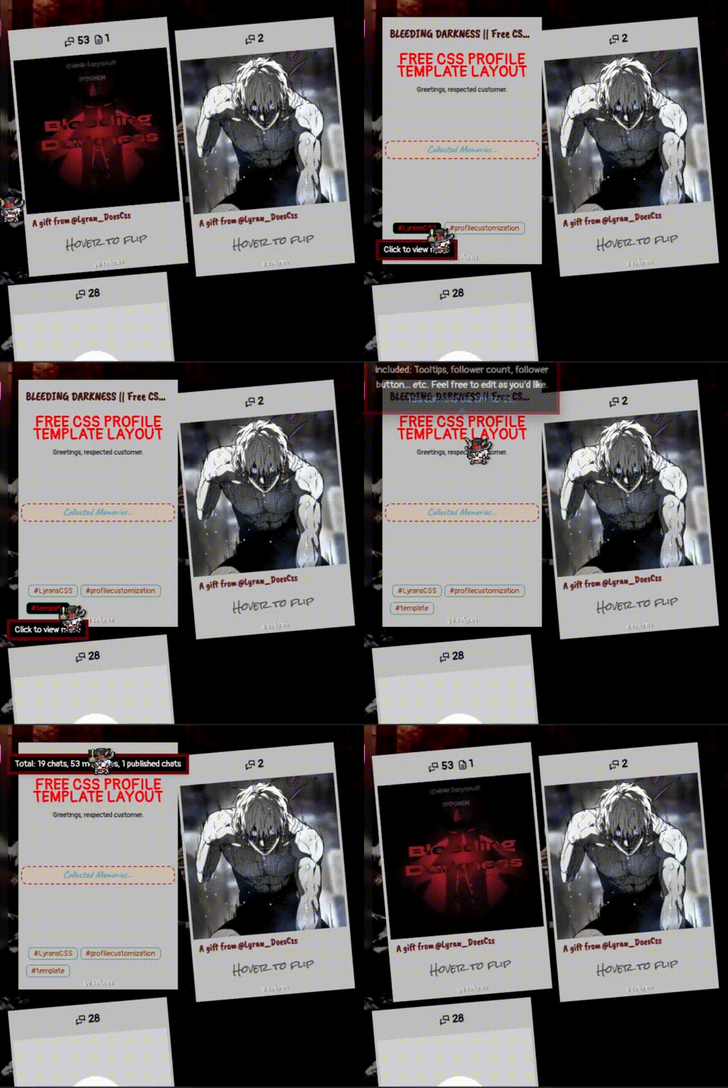
Bot Card Template
Preview
The code
KEEP IN MIND...
» If you see anything that has "NO" in their class, NOT TOUCH! LEAVE IT ALONE!
» Don't see any comment next to the element? Ignore it. Don't worry your little head about it, okay? <3
» Copy your old code and paste it somewhere, like notes or docs, so you can back out and avoid conflics.
PASTE EVERYTHING!!! Yes, E V E R Y T H I N G. Be careful when you tweak it, it might break or not work at all.
1 2 3 4 5 6 7 8 9 10 11 12 13 14 15 16 17 18 19 20 21 22 23 24 25 26 27 28 29 30 31 32 33 34 35 36 37 38 39 40 41 42 43 44 45 46 47 48 49 50 51 52 53 54 55 56 57 58 59 60 61 62 63 64 65 66 67 68 69 70 71 72 73 74 75 76 77 78 79 80 81 82 83 84 85 86 87 88 89 90 91 92 93 94 95 96 97 98 99 100 101 102 103 104 105 106 107 108 109 110 111 112 113 114 115 116 117 118 119 120 121 122 123 124 125 126 127 128 129 130 131 132 133 134 135 136 137 138 139 140 141 142 143 144 145 146 147 148 149 150 151 152 153 154 155 156 157 158 159 160 161 162 163 164 165 166 167 168 169 170 171 172 173 174 175 176 177 178 179 180 181 182 183 184 185 186 187 188 189 190 191 192 193 194 195 196 197 198 199 200 201 202 203 204 205 206 207 208 209 210 211 212 213 214 215 216 217 218 219 220 221 222 223 224 225 226 227 228 229 230 231 | <div class="creds-DO-NOT-DELETE">
<a href="https://janitorai.com/profiles/fd7c024a-9aed-437f-8f07-2d63b645256a">Bot Card template by @JustCallMeJJ</a>
<style>
.creds-DO-NOT-DELETE {
text-align: center;
}
.creds-DO-NOT-DELETE a {
font-family: Pangolin;
font-size: 15px;
color: white;
opacity: 70%;
text-decoration: underline;
transition: all 0.5s ease-in-out;
}
.creds-DO-NOT-DELETE a:hover {
opacity: 100%;
color: red;
transition: all 0.5s ease-in-out;
}
</style>
</div>
<style class="botcard-custom">
.pp-cc-name {
font-size: 1.2em;
font-family: Caveat Brush;
color: #431611;
}
.pp-cc-description {
font-family: Pangolin;
color: #403B35;
font-weight: 600;
}
.pp-cc-wrapper {
background: #BFBFBF;
border: 5px solid #BFBFBF;
}
.pp-cc-avatar {
filter: grayscale(50%);
border-radius: 0;
}
.profile-character-card-creator-name-link {
font-family: Caveat Brush;
font-size: 1em;
color: #601B1C;
}
.profile-character-card-creator-name-link::before {
content: "A gift from";
padding-right: 2px;
}
.pp-cc-wrapper::after {
font-family: Rock Salt;
color: #403B35;
}
.pp-cc-tokens-count {
font-family: Berkshire Swash;
text-shadow: 2px 1px #736B5E;
}
.pp-tag-limitless {
font-size: 0;
font-family: Caveat;
font-weight: 900;
color: #5B9EB9;
background: rgb(243, 192, 149, 30%);
border: 2px dashed #B3423D;
}
.pp-tag-limitless::after {
content: "Collected Memories...";
font-size: 1rem;
}
.pp-cc-tags-regular, .pp-cc-tags-custom {
font-family: Pangolin;
color: #8A2F02;
border: 1px #508569 solid;
padding-top: 2px;
}
.pp-cc-tags-regular:hover, .pp-cc-tags-custom:hover {
color: red;
background: black;
}
.pp-cc-chats, .pp-cc-public-chats {
color: black;
font-family: Pangolin;
}
</style>
<style class="botcard-config-NO">
.pp-cc-gradient-1, .pp-cc-gradient-2, .pp-cc-gradient-3, .pp-cc-star-line {
background: transparent !important;
opacity: 0;
}
.pp-cc-wrapper {
height: 400px;
border-radius: 0;
transform: rotateZ(-5deg);
transition: all 0.5s ease-in-out;
}
.pp-cc-wrapper:hover {
transform: rotateY(180deg) rotateZ(0deg) translateY(-10px);
transition: all 0.5s ease-in-out;
}
.pp-cc-wrapper:hover .profile-character-card-description-box, .pp-cc-wrapper:hover .pp-cc-tags {
opacity: 100%;
z-index: 2;
transition: all 0.5s ease-in-out;
}
.pp-cc-wrapper:hover .profile-character-card-name-box {
opacity: 1;
position: relative;
z-index: 2;
transition: all 0.5s ease-in-out;
}
.pp-cc-tokens-count {
transition: all 0.5s ease-in-out;
}
.pp-cc-wrapper:hover .pp-cc-tokens-count {
transform: rotateY(180deg);
transition: all 0.5s ease-in-out;
}
.profile-character-card-name-box {
transform: rotateY(180deg);
opacity: 0;
text-align: center;
transition: all 0.5s ease-in-out;
}
.profile-character-card-avatar-aspect-ratio {
height: 250px;
opacity: 1;
transition: opacity 0.5s ease-in-out;
}
.profile-character-card-creator-name-link {
position: absolute;
bottom: 70px;
transition: all 0.5s ease-in-out;
}
.profile-character-card-description-box {
position: absolute;
top: 60px;
transform: rotateY(180deg);
opacity: 0;
}
.pp-cc-tags {
position: absolute;
bottom: 0;
left: 0;
right: 0;
transform: rotateY(180deg);
opacity: 0;
}
.pp-cc-wrapper:hover .profile-character-card-avatar-aspect-ratio, .pp-cc-wrapper:hover .profile-character-card-creator-name-link, .pp-cc-wrapper:hover .pp-cc-chats, .pp-cc-wrapper:hover .pp-cc-public-chats, .pp-cc-wrapper:hover::after {
opacity: 0;
transition: all 0.2s ease-in-out;
}
.profile-character-card-stats-box {
position: absolute;
top: 5px;
left: 0;
height: 30px;
}
.pp-cc-ribbon {
filter: none;
inset: 0;
}
._wrapper_lg2d8_47 {
display: flex;
}
.pp-cc-ribbon-wrap {
clip-path: none;
background: transparent;
box-shadow: none;
}
.pp-cc-chats, .pp-cc-public-chats {
justify-content: center;
padding: 2px;
font-size: 1.1rem;
transition: all 0.5s ease-in-out;
}
.pp-cc-wrapper::after {
content: "Hover to flip";
position: absolute;
bottom: 30px;
right: 0;
left: 0;
text-align: center;
transition: all 0.5s ease-in-out;
}
.profile-character-card-tag-limitless {
position: absolute;
bottom: 150px;
left: 0;
right: 0;
height: 30px;
}
@media (max-width: 768px) {
.pp-cc-wrapper::after {
content: "Tap to flip"
}
}
</style>
|