Top-Left Magic Corner Desktop Paradigm
After a decade of daily driving GNU+Linux operating systems, I've had the chance to hop between all major desktop environments. Even though GNOME, KDE Plasma, Budgie, Pantheon, XFCE, LXQt, and even Unity all have major pros, in their default setup, none of them fit my specific usecase. The thing is, this usecase is not that otherworldly: browsing, coding, and writing is not something that would require special tools. However, doing these things as efficiently as possible does require some customization on all major desktop environments. In this post, I'd like to share the customizations that can achieve a more optimized user experience in terms of screen utilization and in terms of cognitive load related to desktop UI interactions.
Screen real estate
For a long time, the looks of macOS, and therefore the looks of elementary OS fascinated me. I found the dock elegant and the black bar at the top a needed bad.

macOS screenshot via qz.com
At least until I realized how wasteful this desktop paradigm is, as most of our screens, including TVs, laptop screens, and computer displays are horizontally wide. This design works well with the width of the keyboard, correlates nicely to our field of vision, and has been a standard since the early years of the cinema.
However, there is a notable limitation in terms of the content we put on our 4:3, 16:9, 16:10 screens: we often process text.
Latin-based writing systems start the text in the top left corner of the page. The text is written from left to right, and each new line requires more space vertically. Furthermore, reading very long lines is tiring for our brains, so there is a practical limit to the width of each page. Therefore, most paper-based sources use the A series paper sizes or similar ratios, which means that reading materials, both physical books and digital media are vertically wide.
So even though enjoying fullscreen media on a standard widescreen, e.g., video games, movies, series, and so on, is a rather pleasent experience. On the other hand, text-based creative work, such as writing text and code, or even just reading webpages or PDFs is often limited by the vertical real estate of our horizontally wide screens.
Therfore, to take maximum advantage of our existing hardware, the vast amount of 16:9 displays, any OS-related clutter should be moved away from the top and the bottom to the side of the screen.
Panels* and docks**
Interestingly, the position of a dock seems to be fixed to the bottom of the screen these days. A few years ago, GNOME had Dash, what functions as a dock in GNOME, on the left side, but they followed the trend, and now it's on the bottom. Elementary, being a close follower of Apple, had Plank in the bottom forever. Hell, now even Microsoft made their bottom panel somewhat of a dock... Even though a dock in the bottom is as much of a waste as a panel in the top, the docks can at least be moved away to the side of the screen where they make a bit more sense.
My biggest gripe lately has been the presence of unmovable top panels.
The top panel in macOS makes at least some sense due to their well-implemented global menu system. But what about applications that do not have menus? In that case, the top panel is just in the way of content.
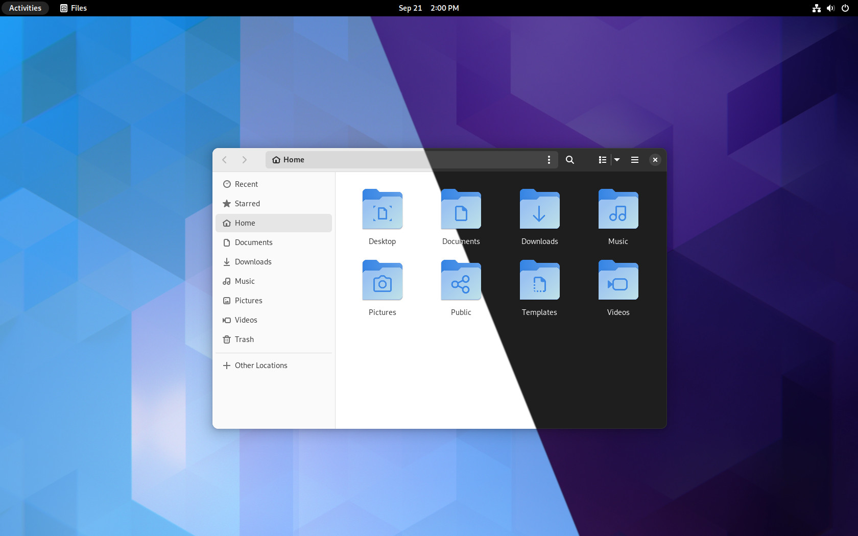
The top panels in GNOME and Pantheon in elementary OS are, as Liam_on_Linux has excellently put it, are an effect of cargo-cult software design. A black or translucent bar that must be on the top to tick the styling box, but it is not really utilized. With no global menu, most of the vertical space occupied by these top panels is simply wasted. Except for the clock in the middle, which can really be useful sometimes.

Plain black top bar with not many useful things in GNOME via b-cdn.net
Of course, with some hackery and extensionory, one could change the panel in both desktops, but that's very far from the intended usage, and that's the problem.
A single panel on the left
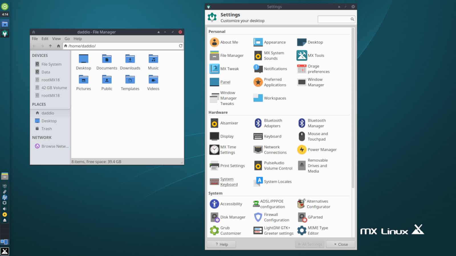
What if there was no top panel? What if the already limited number of useful icons in the top panel could be moved to an extended dock on the side? The default look of XFCE in MX Linux does exactly this. You can also achieve the same thing by moving the Taskbar, or whatever it's called these days, to the side in Windows. In GNOME, there's an extension called Dash-to-Panel that can achieve this. Sadly, in macOS and in elementary OS, you can't do this in a convenient way.

MX Linux sporting a left panel combined with dock functionality via fossbytes.com
With the top panel out of the way and the dock-functionality moved to the side, we can start to enjoy our extended vertical real-estate. This is a more efficient use of screen real estate, excellent. Now, what about the cognitive load related to using it?
The Magic Corner
Unity did, and thanks to the hard work of Rudra Saraswat, Unity still does some things really well. One of the most prominent features to me is that Unity has the window control buttons on the left side of the windows. Microsoft put the window controls on the right in the late 1980s, and they have been stuck there ever since, except for macOS, Unity, and elementary OS. Although, elementary has its own style that seems to aim to be different from everything else rather than being more useful than everything else.
Putting the window controls to the left is rather important in the context of another Unity-specific feature: fullscreen windows have no decorations in Unity. How awesome is that? The window controls just integrate into the top panel when the app goes fullscreen.
This is a really neat and elegant behavior, because it lets you have everything in one place: window controls for the current window, icons for other running applications and your favorite/pinned applications, as well as a button that lets you access all appliactions installed on the system. So when you need to open some other application, everything is there to do that in the top left corner. And if there are multiple windows open, your muscle memory can still follow a natural path to the top-left of the current window to close it or minimize it.
Therefore, if we remove the top panel and put its contents in an MX Linux-style dock-and-panel combo on the left, and move the window controls to the left, a full screen application will have all the benefits that we saw in the case of Unity: everything in one place with the added benefit of the maximized real estate.

My current setup with a Unity-like top-left magic corner and a combined panel in KDE Plasma on Debian
I believe that this desktop paradigm could be a next (half)step toward an ideal desktop environment that hasn't been done before on major distributions. Both Unity and MX Linux come very-very close, but combining their most useful concepts is what could maximize the utilization of standard widescreen real estate and minimizing the cognitive load when switching between applications.
As an aside, I've been using GNOME, Budgie, and KDE Plasma in this arrangement, and all of them worked really well, so the already existing ecosystem could support this paradigm really well.
–Thomas Hastings (read more)
* panel: a full-screen-width or full-screen-height UI component that holds system-related icons, clocks, and such
** dock: a centered UI component that holds the icons of favorite and running applications