𝓹𝓲𝓬𝓴𝓵𝓮𝓭𝓯𝓲𝓼𝓱𝓯𝓲𝓷𝓰𝓮𝓻𝓼' 𝓰𝓾𝓲𝓭𝓮 𝓽𝓸 𝓹𝓻𝓮𝓽𝓽𝔂 𝓹𝓻𝓸𝓯𝓲𝓵𝓮𝓼

Welcome to my Midjourney-based guide on how to enrich both your JAI Profiles, bot biographies and Ko-Fi profiles for creators. Please do not credit me in bot biographies - if I didn't figure these out, someone would have sooner or later. If you'd like to give credit, link this rentry on your JAI profile or on your server if you're a creator. Seeing banners and such get more use makes me feel like such a trendsetter, and I preen under the attention.
1.0 𝓘𝓶𝓪𝓰𝓮 𝓖𝓮𝓷𝓮𝓻𝓪𝓽𝓲𝓸𝓷
1.1 𝓘𝓶𝓪𝓰𝓮 𝓔𝔁𝓪𝓶𝓹𝓵𝓮𝓼
"𝓟𝓲𝓬𝓴𝓵𝓮𝓭 𝓟𝓸𝓹𝓮" 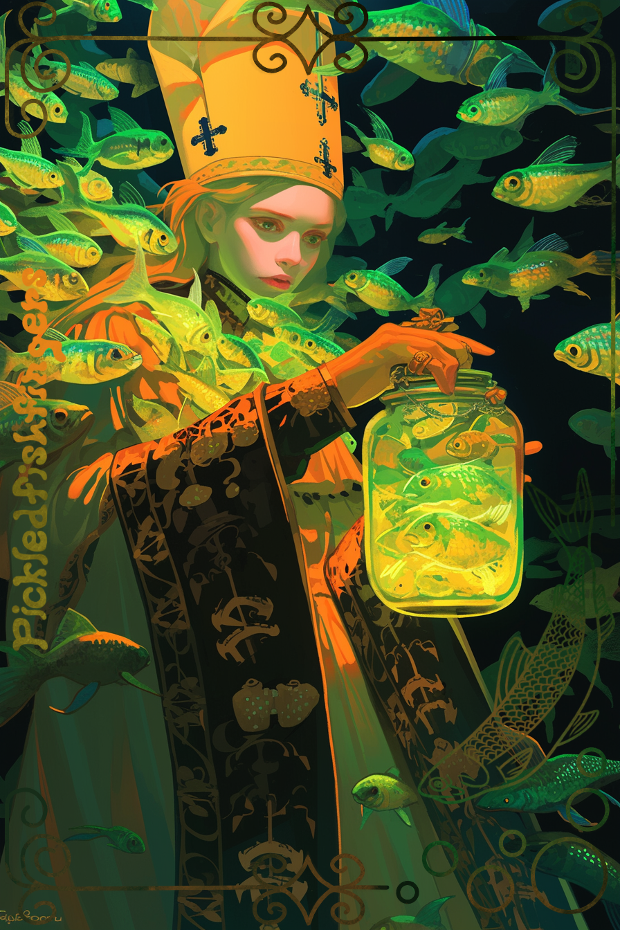
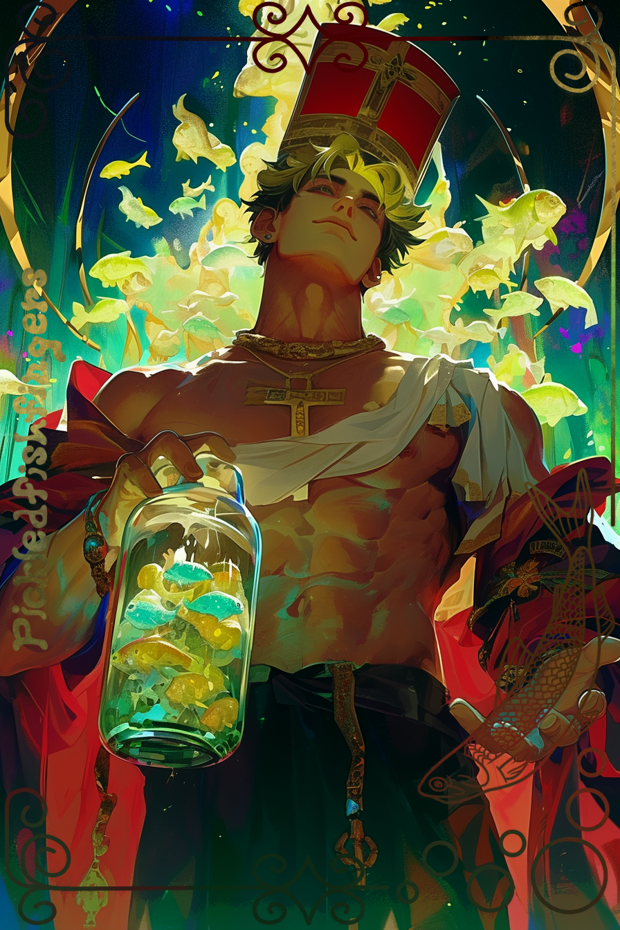 "𝓟𝓲𝓬𝓴𝓵𝓮𝓭 𝓒𝓪𝓻𝓭𝓲𝓷𝓪𝓵"
Note to Viewers
For the rest of this rentry, these two examples will continue to be used for illustrative purposes in the Janitor AI profile sections and bot biography sections.
1.2 𝓘𝓶𝓪𝓰𝓮 𝓟𝓻𝓸𝓶𝓹𝓽𝓲𝓷𝓰
If I'm going to be creating this rentry, I've decided to be extremely thorough. This means I'm going to be covering my image generation process from start to finish. Please note that due to the fact I have a distinct style, this is only for my generation style. If you'd like to know how other creators generate their images, please reach out to them individually. It is their prerogative whether they respond to your message, or are willing and able to divulge how they create their images.
| 𝓟𝓲𝓬𝓴𝓵𝓮𝓭 𝓟𝓸𝓹𝓮 | 𝓟𝓲𝓬𝓴𝓵𝓮𝓭 𝓒𝓪𝓻𝓭𝓲𝓷𝓪𝓵 |
|---|---|
| "Imagine in the style of a dark and grungy fresco painting. Utilize whimsical eclectic colour palette, with a focus on neon green. A female is wearing a pope costume including pope ceremonial robes, pope hat and holding a jar of pickled green fishes. She is inside of a massive cathedral, and the image is full of Catholic symbolism. The fishes surrounding her are multi-coloured and densely packed." | "Imagine in the style of a dark and grungy fresco painting. Utilize whimsical eclectic colour palette, with a focus on neon green. A handsome 19 male is wearing a pope costume including pope ceremonial robes, pope hat and holding a jar of pickled green fishes. He is showing off his lean-muscular physique and pecs, torso and abdominals. He is inside of a massive cathedral, and the image is full of Catholic symbolism. The fishes surrounding her are multi-coloured and densely packed." |
| --ar 2:3 | --ar 2:3 |
| --niji 6 | --niji 6 |
Style (with help from @nonpractical)
"Imagine in the style of a dark and grungy fresco painting."
"Imagine in the style of a [X] and [Y] [Z], composed from the angle of [A]."
Prompt Result "dark and grungy" When paired with any kind of "painting" prompt, this allows you to have more texture, patterns and volumetric mood lighting. It creates that 'visible brush stroke' effect. It has a very nice aesthetic which I consider soft shaded and blended graininess. "fresco" A painting done rapidly in watercolor on wet plaster on a wall or ceiling, so that the colours penetrate the plaster and become fixed as it dries. Fresco as a style is usually iconic with more defined shapes and edges. It has plastered texture. However, the best use for the fresco prompt is that it allows Midjourney to generate high detail in the surroundings of the character - not just depths of detail, but quantity of detail. It's great for characters surrounded by crowds, maximalist settings or animals. "Fragonard" A variant of the Rococo style. This is absolutely amazing for ornate details on clothing and background, while still keeping faces soft and less realistic. Use this if you'd like to tend more towards light-coloured realistic generations. "Caravaggio" Emphasis on lights and darks. This can be placed somewhere between realism and semi-realism. "Michelangelo" Realistic but flat style. "fresco + [OTHER STYLE]" Combine the above two prompts for a kind of 'semi-realistic' style. [A] The composition and angle.
Colour
"Utilize whimsical eclectic colour palette, with a focus on neon green."
"Utilize [X] [Y] colour palette, with a focus on [Z+]."
Prompt Result "whimsical" Playfully quaint or fanciful, especially in an appealing and amusing way. I notice that this actually helps to create more dynamic motion in the picture. It allows the generation to move away from realistic colorations and more into artistic visual harmony, with certain colours otherwise not perceive in real life added to enrich the image. "eclectic" Deriving ideas, style, or taste from a broad and diverse range of sources. This helps for variation not only in the actual colours, but in the shades, tints, tones and saturation. It's a maximalism prompt. "focus on" By giving colours for the image to focus on, you're able to retain an overall theme. I recommend giving specific kinds of colours. For example, 'midnight blue' instead of just blue, or 'marigold' instead of yellow. If you're noticing that the focus is beginning to override the skin tone (e.g, your character is becoming blue), introduce 'skin tones' as a focus.
Character
"[J] a [Q] handsome 19 male is wearing a pope costume including pope ceremonial robes, pope hat and holding a jar of pickled green fishes."
"A [X] [Y] [Z] with [L, M, N+] is wearing a [W] including [A, B, C+]."
Prompt Result [J] Modifier for view of character. Consider trying out 'close-up view of', 'distant view of', 'side-profile view of' or 'back view of' etc. You can also choose to put composition notes here, such as 'angle from the floor,', 'angle from the sky,' or 'angle from the victim/target's POV,' (this one is super fun for immersion!). Play around, see what works. [Q] Modifier for character personality or mood. You'd be surprised how well this works. It's because of word associations. Non-visible character traits still have associations with visible physicality. For example, try 'dirty-minded' or 'evil' or 'happy'. Why do I recommend this? Facial expressions. This makes it ten times more likely for the AI engine to give you a facial expression, which Midjourney struggles with, usually defaulting to resting bitch face or neutrality. Midjourney tends to give caricatures if you prompt for 'smirk' or 'shouting'. "handsome" The modifier for appearance, where you can variate the feel of your character into things like gorgeous, pretty, handsome, masculine, feminine, cute etc. A surprisingly good modifier is 'Tiktok Pinterest' for conventionally attractive. Use it if you've prompted for horror or villainy and it's giving you ugly bad guys because of word association. You can also put ethnicity/race modifiers in this field, which are way more effective than prompting for skin tone and hair texture. "19" Age is actually extremely helpful for giving a feel of your character. I choose 19 for most of mine, because it's the best at giving not-too-slim not-too-muscular males. The higher your age on males, the more likely it is to give facial hair. The higher your age on females, the more likely it is to give bigger breasts. "male" The sex of your character. Do NOT use 'boy' or 'girl'. This will give you a child generation. 'man'/'guy' and 'woman'/'gal' are preferable. In this field, you can also input any gendered occupational term. For example, 'priestess'/'priest'. [L, M, N+] The list of your character's appearance, such as skin tone, hairstyle, hair colour, eye colour and so on so forth. "pope costume" The theme of your character's clothing and style. The word costume prevents it from typecasting your character. For example, putting 'pope robes' may make Midjourney give me an elderly man despite other prompting. You can consider 'firefighter costume' for occupational roles or 'cottagecore costume' for vibes/aesthetics. "pope ceremonial robes, pope hat and holding a jar of pickled green fishes." Here, itemize your list of the characters' clothing and props, all in one place.
Dynamic Motion
"Not included in original prompt."
"Pronoun is [Q] verb pronoun [X], pronoun [Y] [Q] verb pronoun [Z]"
Prompt Result "dynamic pose"Please NEVER use dynamic pose. The AI engine training on dynamic posing is all sports photoshoots and dynamic modelling poses. They do NOT look candid. [X] Here, input any object/item/entity the character is interacting with. For example, "he is playing his electric guitar", "he is petting his cat", or "he is writing in his dream journal". [X] [Y] Additional sub-interaction or motion. For example, you might have "he is shredding his electric guitar while he performs on stage", or "he is petting his cat while sipping his coffee" or "he is writing in his dream journal while hunched over his desk". [Q] Adjective modifiers. As with all good show-don't-tell prose, feel free to add adjective modifiers. For example, he may not just be smiling, he may be 'smiling wickedly' or 'smiling amorously' or 'smiling fondly'. He may be playing his guitar energetically, casually or sullenly. He may be petting his cat wistfully, teasingly or absent-mindedly. He may be writing in his dream journal frustratedly. You get the point.
Shirtlessness (optional)
"He is showing off his lean-muscular physique and pecs, torso and abdominals."
"He is showing off his [X] physique and [Y+]"
Prompt Result "lean-muscular" The overall physique of your character. "pecs, torso and abdominals" An itemized list of all the muscle groups you want in your shirtless image. Please note that adding these muscle groups tends to prompt the AI engine towards bulkiness and muscularity, and the more you add the more this is true. You may need to prevent beefiness in --no. Using this prompt word-for-word will not set off filter flags.
Setting
"He is inside of a massive cathedral, and the image is full of Catholic symbolism."
"He is inside of a [X], and the image is full of [Y]."
Prompt Result "massive cathedral" The base setting for the image. "full of Catholic symbolism." The overall aesthetic of the image's setting. For example, if your image is set in a hippie coffee shop consider 'full of associated 80's hippie culture visuals'. Wilderness, and the genre is horror? 'Full of associated horror visuals'.
Crowd Density (optional)
"The fishes surrounding her are multi-coloured and densely packed."
"The [X] surrounding pronoun are [Y] and densely packed."
Prompt Result "fishes" The item, object or entity you want to have crowded in the image. For example, consider 'plants' in a botanical garden. It also works for visual effects like electricity and fire if you're creating a magic-wielding character. Actually, in general crowd density is brilliant for any kind of special ability. "multi-coloured" Modifier for type variance. For example, using the above botanical gardens, you may consider using a 'species diverse' prompt.
Parameters
Prompt Result --no Will try and remove the prompt from the image. My go-to is no facial hair. Additionally, you can use this in itemized formats to quickly and accurately prevent issues with your gens. For example, I mentioned before that shirtless prompting with muscle groups can cause beefiness. So, I would put --no muscular, beefy. It works in reverse too for --no slim, skinny, twink. You can also do generalities, like tacking on --no ugly. Because MJ is biased on skin tones, try --no pale, paleskinned, whiteskinned. If you're having trouble getting a night time gen, consider --no daylight, sunlight, daytime. --aspect or --ar The aspect ratio of your image. It is width and height in that order. Lots of creators use 2:3 for their generations. --sref Paste an image into your discord, then open it with discord and paste the url after this parameter. Alternatively, attach it in the app. This will mimic the image's style. Sref is not accurate, and I don't use it a lot. For best results, copy and paste multiple URLs of images in the same style one after another seperated only by a single space. --cref Paste an image into your discord, then open it with discord and paste the url after this parameter. Alternatively, attach it in the app by pasting it into the prompt bar. This will mimic the character inside the image. This is EXTREMELY accurate and is a great feature. --chaos <number 0–100> Change how varied the results will be. Higher values produce more unusual and unexpected generations. Not recommended. --niji 6 Puts it into the niji 6 style, which is the latest and most recent version used by most bot creators.
Word Associations
Word associations are extremely strong tools in both good and bad ways. You'll eventually get a feel for how they work, but always be cognizant of them. For example, prompting for jock has implications on hairstyle, clothing, posture, facial expression. Prompting for butterflies will make your character more feminine looking. Prompting for red hair will also make him pale and have freckles by default. Prompting for skater will make your character skinny and wear baggy clothes. This is where the --no tool is most powerful, in that it can help combat these stereotypes and associations. Oftentimes, you won't realize Midjourney is going to make the association until your first batch of generations.
Word Choice Specificity
Always choose the more exaggerated word, because Midjourney has a tendency to underperform. So, when prompting for 'big', instead try 'enormous', 'massive' etc. Specificity is important. Think of it like this. AI art works off data sets, and if you think of each word as a portfolio of everything on the internet tagged with that word, you can plot it on a graph. People mistag all the time, and things tagged with the commonly used 'big' may not actually be big. This also applies to species. AI Art is the sum and average of its portfolio data. If you prompt 'tiger', then since the black and orange variant is a majority when it comes to data sets, the output will likely be too.
You'll learn quickly that it's never just a shirt. It's a button-up shirt. It's a tunic. When it comes to pants, they're low-waisted chinos. When it comes to hairstyle, it's a medium blowout with tapered sides. It's an 'apaturus iris butterfly species'.
1.3 𝓘𝓶𝓪𝓰𝓮 𝓡𝓮𝓯𝓲𝓷𝓮𝓶𝓮𝓷𝓽
"𝓟𝓲𝓬𝓴𝓵𝓮𝓭 𝓟𝓸𝓹𝓮 𝓡𝓪𝔀" 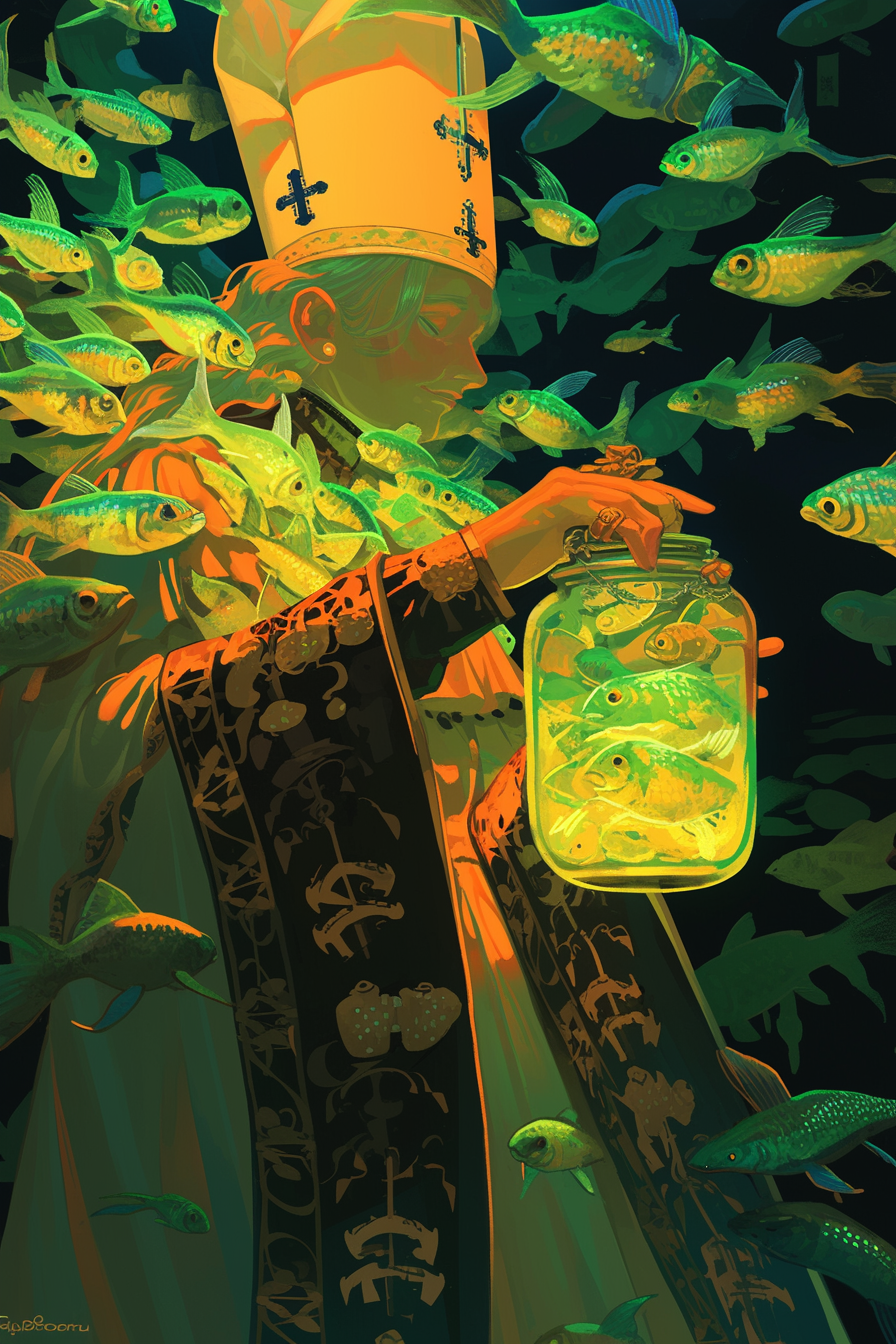
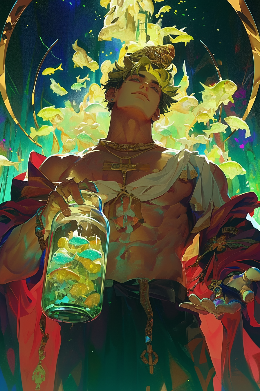 "𝓟𝓲𝓬𝓴𝓵𝓮𝓭 𝓒𝓪𝓻𝓭𝓲𝓷𝓪𝓵 𝓡𝓪𝔀"
So, you finally have a raw image you're satisfied with - what are you going to do next?
Upscaling
Prompt Result Upscaling in Discord This will completely preserve the original generation, but bring it to the front of your feed and open up variation options. To proceed in Discord, this is a must. Upscaling on AppDifferent from Discord, you can open up variations by simply clicking onto the generated image on your dashboard. I've put a nice little strikethrough line on this one to warn you that you should NOT be using Upscale (Subtle) or Upscale (Creative) to bring it to the front of your dashboard without knowing what you're doing. In the app, it actually doesn't matter if you upscale or not. You can do all the same things, and the image after download will be the same pixel scale. Upscale (Subtle)Smooths out the image by removing textures, patterns and harsh lighting. I'm a non-believer. All me and my homies hate Upscale (Subtle). Not only will it desaturate and grey-out your image by adding blue light, it completely ruins a lot of the ambience. Upscale (Creative)The only thing creative about this is the creative ways Midjourney finds to fuck up your original image. This isn't as bad of an offender as Upscale (Subtle) in sucking the life and detail out of your image, but it makes up for it elsewhere. It will remove items and entities in the background, ruin some aspects of the anatomy, ruin cohesion, remove small props, make the face more two-dimensional.
Varying
App usage assumed - for Discord, 'vary' is actually 'remix' just under a different name.
Prompt Result Vary (Subtle) An absolutely amazing tool for getting variations on your initial prompt. Whack the Vary (Subtle) button, and keep whacking it until you're satisfied with the pose, composition, appearance and background. Please not that you should NOT expect Vary (Subtle) to get everything right. It's mainly for major fixes that would be impossible or counterintuitive to do with Vary (Region). Vary (Strong)Save yourself the experimentation and simply never use this. You have no control over Vary (Strong), and it will proceed to disregard most of your initial prompt and put out something resembling a shoddy imitation. It works... sometimes. It will rehaul most of the style, aesthetic, background, pose, composition and some character traits. Usually not in a good way.
Remix
Prompt Result Remix (Subtle) Essentially, this is Vary (Subtle) with extra steps, in that it allows you to edit certain aspects of your initial prompt. You can change color details, style, pose, action etc. It's important to note that this is interpolative. If you don't understand, imagine this - the generation given by your initial prompt, the generation given by this new prompt if you were to generate it separately. The Remix (Subtle) will generate somewhere between these two generations. This means that more the intensely you rehaul this new prompt, the more potential for fuck-ups Midjourney will make. You run the risk of distortion, inaccuracies and all that good stuff. If you use this, my recommendation is to make small tweaks and changes. It works best by preserving the original prompt and adding new detail to items, objects and backgrounds, or by adding new --no tags. Remix (Strong)Yeah, no. Even when you preserve the initial prompt, what it will actually do is double down on the prompt and exaggerate it. Imagine your initial generation squared. If you change too much, it works just like Vary (Strong) but worse. Don't recommend.
Pan and Zoom
Prompt Result Pan Extends the image in a certain direction. You can't choose the amount it pans by, it simply doubles your initial aspect ratio. So, if you have a 2:3 image and click pan right, it will now be 4:3. It's good accuracy in the same way your initial generation was, in that it's still a bit of a lottery. Zoom Zooms out from your image by certain ratios. It's good for flat images with not a lot of perspective or angle nuance, but if you have things like foreground objects, closer limbs, ant's eye view or such, it'll fail miserably and you'll end up with a distorted mess. Change AR (method one) This is Pan+, in that it gives you a little more freedom over how much the image is being extended in certain directions, and also allows you to do extensions from the center. If you want to pan, I'd recommend just choosing this one. Change AR (method two) You can use custom zoom to change your AR. Once you press custom zoom, change zoom back to 1 (unless you want to zoom out as well) and just change the AR in your prompt to the one you want. Example: Prompt --ar 2:3 to Prompt --ar 1:1 --zoom 1
Vary Region
The holy grail of image refinement. Here, you use the lasso tool (don't use the square, please and thank you) to select an area to vary. The image will be varied based on what is immediately on the perimeter of the lassoed area. So, for example, if you vary the entire head and neck region, it may just replace it with background. Zoom in with your mouse to get close to where you think the perimeter will be most conducive to supporting your edit.
Don't use your original prompt. Create a new and small prompt with an itemized list of what you want edited in. It's best to find multiple synonyms or wording of the same phrase in different combinations, which essentially tricks the AI engine into doubling down on your prompt. If you simply repeat the phrase copy-pasted ten times, it will register as 1:1 repetition and not achieve this effect, as the engine will redact it down.
Be cognizant of the perimeter, now and always! Amen!
Prompt Result Relativity Midjourney actually understands relativity when it comes to image content outside of the perimeter. For example, if you're selecting a character's pencil held in his hand, you can include 'held in his hand' in the prompt and Midjourney will apply common sense to get the image resolved. If you don't do this, you risk losing shadow and highlight. It's also great for telling Midjourney 'why?'. If your perimeter is entirely background, but you want to fill in a new item, it won't support this. Let's say a lamp on a desk. Instead of just prompting 'lamp' you can prompt 'lamp sitting on desk to provide lighting'. Using --cref to Fix Faces Every tried to vary and image's face, only to find it was worse than it began with? There's a useful trick. In your vary prompt, you can still add new parameters, one of which is --cref. Find a face from another generation that you like, or even the same generation you're working on! Then, fill in the face with the --cref prompt, and it will pull from this face, but tweak it to make it more holistic to your image. Using Images for Hard Edits No matter how hard you try, you just can't seem to get Midjourney to input the new object/visual effect/body part etc.? Use this method. First, try out getting an image of the item/object/visual effect. Copy and paste the URL link at the beginning of the prompt. Using --cref and --sref for Hard Edits Above still not working? Use --sref and --cref both to input the image in addition to the image URL at the start of the prompt. Don't worry about --sref. Because it works on perimeters, it will mesh it to your image's style. Expect it to be a little wonky, but then you can do more region varying to fix up output. Using --cref and --sref, Hardcore Edition I want my character to wield a sword, but it just won't put a sword in! When I tried the methods above, it came out so weird I couldn't even image vary it to make it work. It made no sense with my character's pose/anatomy. Fret not. Download the image you're working on. Use an art program, and either edit your prop/visual effect/alteration onto the image or draw a very rudimentary version in yourself. Next, use this saved image as an --sref or --cref for your image in addition to the above method. This tells Midjourney not only to put it there, but that it should be there to begin with. Even if you're a shit artist, it will mesh your rudimentary artwork with the surrounding style.
2.0 Janitor AI Profiles
2.1 Profile Picture
"𝓟𝓲𝓬𝓴𝓵𝓮𝓭 𝓟𝓸𝓹𝓮" 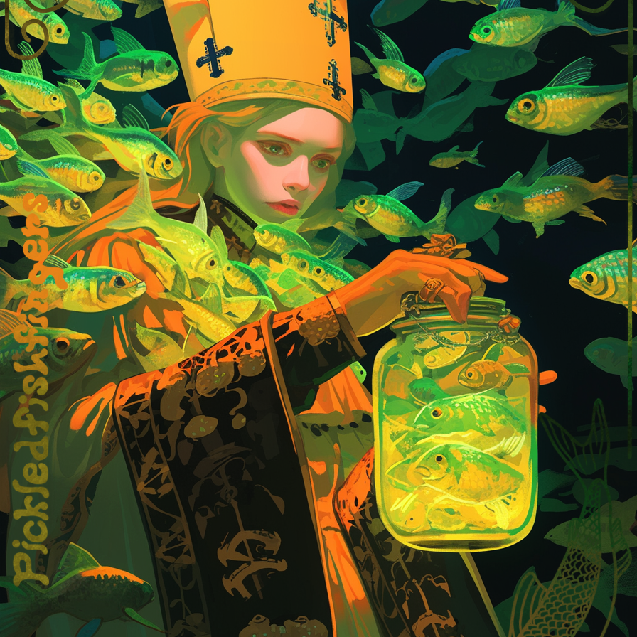
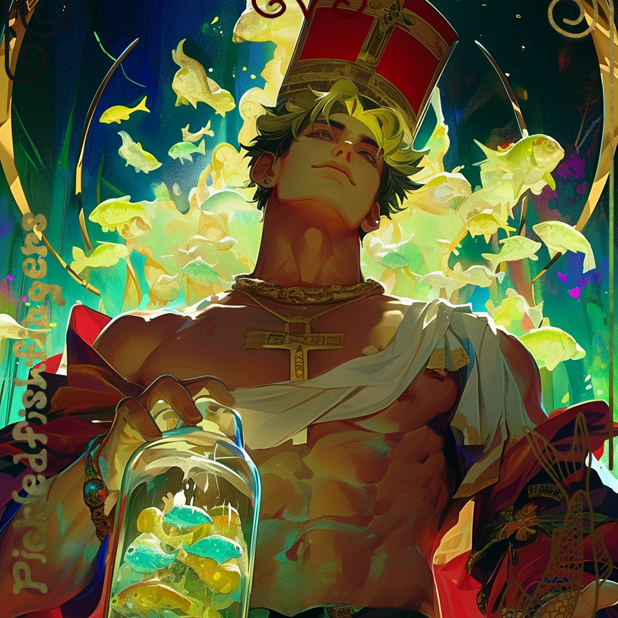 "𝓟𝓲𝓬𝓴𝓵𝓮𝓭 𝓒𝓪𝓻𝓭𝓲𝓷𝓪𝓵"
The way to make profile pictures is exceedingly easy. If you initially chose to make your image --ar 1:1 (or, this is the default, so you didn't need to prompt it), just go ahead and upload it to your Janitor AI profile. Made it in a different aspect ratio? If you don't mind cropping, upload it as is, and the profile picture will start from the top of the image. If you want a 1:1 version that expands on the edges of the original to avoid cropping, find the generation in question then either use Change AR or Make Square in Discord to adjust the aspect ratio.
If you want a little more control over cropping your photo, or if you've made post-edits in an art program, just open it on your laptop or phone's photo app and click edit. Using cropping, bring it down to a 1:1 ratio, and you can choose where the height and width starts and finishes. This option is great for zooming in on faces.
2.2 Profile Sections
The complete list of profile sections taken from my own profile. Additionally, a table below will outline what other creators may put in their's that I don't have. Frankly, it's shocking that something like that exists. A reminder, my profile is extensive, and its completely fine for you to pick and choose sections, or combine them together to reduce size.
| Section | Description |
|---|---|
| Introductory Tagline | Usually includes basic information about you, the creator. This includes your JAI username, age, pronouns. |
| Recommended Listening | Give a song that encompasses the general vibe of your or your account, perhaps both. There's several templates available to be copy-pasted on the Emoji Combos website. |
| Self Quote | A quote from yourself, or just a quote you like. |
| About Me | Your preferred name of address, some general information about you as a person, what themes and genres you enjoy. |
| About My Account | Here, put general vibes of the bots you create. Sex, OC/fictional, POVs and Limitless/Limited. If you have a particular niche you like to cater for, this is a great place to put it. |
| Content Disclaimer | If you feel the need to have one. |
| Bot and Setting Variation Policy | So that people know if they can alter your bots in any way for either public or private use, and how to go about doing so. |
| Lore | A list of your bot settings. Consider looking into making a Carrd. |
| Discord | A link to your Discord, and what they might be able to find there. |
| Creators and Friends | Links to other creators and friends you interact with and/or admire on Janitor AI. |
| Ko-Fi | A link to your Ko-Fi, or wherever else you might be taking donations or commissions. |
| To-Do-List | Self explanatory. |
2.2 Profile Banners
2.3 Profile Theme
2.4 CSS Code Blocks
Profile Background
Go into settings and scroll down to your profile source code. Input this at the very top or very bottom. Adds a background to your profile. For aspect ratio, I recommend 2:1. Below is an example of a full-greyscale filter.
<style>
img{
filter: grayscale(100%);
-webkit-filter: grayscale(100%);
-webkit-transition: all 0.2s ease;
}img:hover{
filter: grayscale(0%);
filter: gray;
-webkit-filter: grayscale(0%);
filter: none;
transition: 0.2s ease;
}
</style>
For a list of possible filters and how to input them, visit https://www.w3schools.com/cssref/css3_pr_filter.asp.
You may notice that the filter applies to every single image on your profile, including banners on your profile. To stop it applying to your banners, you can go to the img markdown in your settings code and add 'filter: none;' or whatever filter you'd like to apply. There is currently no way to stopping the profile filter from applying to your profile picture.
Link Colours
This is to add colour to your profile links. I recommend colour-picking 1-4 colours from your profile pictures or banners for use in your links. Below is an example from my own profile, where I just added a base colour to every link, and then a special colour on hover. Please note that 'visited link' will be the base colour for your username on your bot grid, as anyone on your page to see them will have visited said link.
<style>
/ unvisited link /
a:link {
color: #53805B;
}/ visited link /
a:visited {
color: #53805B;
}/ mouse over link /
a:hover {
color: #C3F238;
}/ selected link /
a:active {
color: #53805B;
}
</style>
Rotate Image Hover
This will make your image rotate slightly when you hover over it with your mouse. It has a different markdown format than what is normal.
<style>
.rotate-img{
transition: 1s ease;
filter: saturate(100%);
}.rotate-img:hover{
-webkit-transform: rotateZ(-10deg);
-ms-transform: rotateZ(-10deg);
transform: rotateZ(-10deg);
transition: 1s ease;
}
</style>
Rotate Image Hover Part Two - Link
This will link your image to a website. For now, I'm using Io's as an example.
<a target="_blank" rel="noopener noreferrer nofollow" href="https://io-modernfantasy.uwu.ai/"><img src="https://files.catbox.moe/qmqsqc.gif" class="rotate-img" alt="modern fantasy"></a>
3.0 Character Biographies
3.1 Character Biography Sections
3.2 Character Banners
Visual Merits
Visual Weight Balancing
A character banner is just like any other kind of banner, in that it's enriching your profile by adding additional visual elements for your audience. If you're following my suggestions for extensive character biographies, character banners are one of the ways to stop viewers from feeling like they're staring down the Great Wall of "Fuck Reading All That!". If you're also choosing to introduce background settings, it prevents your bot biography from becoming too bottom-heavy.
Practical Merits
Insight Into Character
Your bot profile image is the definitive focal point of style, theme and character. It personifies who they are as a fictional entity, and what the {{user}} should feel interacting in the scenario with that character. Which, unfortunately, means that obscuration is sometimes aesthetically necessary. Let's say, for example, in your bot profile image you have a character who: wears a mask, is partially obscured in body due to dynamic motion, has a non-frontal angle depiction of their face.
People love to know who and what they're getting down and dirty with. This means that character banners can offer an alternate depiction of your character. This can be in their physicality (fully visible face, fully visible body) or character wise (reflecting another aspect of their character, showing a different emotional state, an important premise of the scenario). @nonpractical demonstrates this in her Theo Silva | Husband alternate scenario bot, where she uses the character banner to show him cradling a baby.
Information Dissemination
The banner will attract the eye's attention. As such, it allows you to cluster important information around it, increasing the likelihood of skim-readers being properly informed before engaging with your bot. Personally, I like to nestle my character banner amidst the: blurb, tag line, content warning, and artificial intelligence disclaimer.
| Banner Creation Step | Detailed Explanation |
|---|---|
| Decide on a plain background theme! | A simplistic and overarching theme that encompasses the aesthetic of your character. Alternatively, you can create 'cinematic backgrounds' for character banners, placing them in an alternate setting. It's completely up to you. However, I'll be moving ahead with the simplistic kind of banner. |
| Follow this template, or tweak as necessary! | "Plain whimsical [COLOUR] wallpaper. Pattern of [COLOUR] minimalistic and simiplisitc [COLOUR] [SETTING/OBJECT/THEME/ENTITIES]. [COLOURS] and [THEME]. [COLOURS]. --ar [ASPECT RATIO] --niji 6" |
| "Plain whimsical cardinal red wallpaper. Pattern of neon green minimalistic and simplistic neon green fish. Crimson red colours and heavy Catholic symbolism. Deep blue-green and gold accents. --ar 6:1 --niji 6" |  |
| RESULT 2 |  |
| RESULT 3 |  |
| RESULT 4 |  |
| Grab the character profile image! |  |
| Select the area of the banner you want your character to appear in! |  |
| What information do I need for the prompt? | You'll need the style, as well as the most general description of the character, including important traits. I like to reinforce the background imagery if I'm varying the edge of the banner, but it's not necessary if you're varying the center or leaving a bit of the edge when you lasso. Reinforce the background colour. Add the prompt "Drop shadow, darker background." for a gradient shadow behind the character (only works with full edge variations) or "Fully visible face." to have the face included. |
| "Image in the style of a dark and grungy fresco painting. 19yo male in a pope costume with cardinal robes and a gold crucifix necklace. Neon green fish imagery. Dark crimson plain background. --ar 6:1 --niji 6 --cref [CHARCTER]" |  |
| RESULT 2 |  |
| RESULT 3 |  |
| RESULT 4 |  |
| Next, go to your art program of choice and add a name tag! | There's tonnes of free art programs to use, but I use IbisPaint Pro. It does me well. I've seen others use Clipstudio, Canva, Photoshop, Illustrator and even Paint to achieve good effects. |
| Experiment with things like font and text effects. This was done by using a brush over the text in alpha lock. |  |
| Experiment with placement, too. Text may look better and more visually appealing in certain areas of the banner. Usually, choose one that's less busy. You can choose different colours, and try out different stroke outlines. |  |
| I like the colour of the text and outline, but let's try a different font and location. |  |
| Perfect! Let's add some additional detail to the background as a final flourish. |  |
3.3 Background Settings
Color Matching and Tonal Corrections (I don't know where to put this, you can decide :) )
Not all art programs are capable of everything that we will be discussing!
Here forward I will be using Cliptstudio Paint Executive, but there are many free to use programs, such as IbisPaint, that (I believe) have the same features/the necessary features to allow for you to correct your image.
Why?
I believe that tonal correcting and color matching helps seamlessly blend your character and background, making them seem a part of their environment instead of slapped on top of it. You may not need tonal correcting for simple/simplistically patterend backgrounds, however for more dramatic/environmental backgrounds I believe it is a must.
| Tonal Correction Steps | More Detailed Explanation |
|---|---|
| Start with your background image and charcter. For this tutorial I will be using my Henry Nelson Banner. Background and Character should be on seperate layers at all times |  |
| All of the features we will be discussing (starred)! |  |
| Contrast/Brightness: Changes the brightness and contrast of your image. Changing your contrast will make it more visually striking/different than the background image. | |
| Tone Curve: This allows you to change the levels of Red, Green, and Blue in an image through changes in color input/output. You can change the overall RGB levels, or through individual adjustment. (P.s. RGB is the primary colors of digital art. Why? Because those are the main three colors of a computer screen! This is why art appears different when printed out then it does on your computer, since IRL primary colors are RYB.) | |
| Color Balance: This allows you to change the levels of Purple, Cyan, and Yellow in an image thorough changes in color input/output. It works simiarly to Tone curve. (Another P.s. Purple, Cyan, and Yellow are the secondary colors of digtial art) | |
| - Red & Blue= Purple | |
| - Red & Green= Yellow | |
| - Blue & Green= Cyan | |
| Color match: Color match is feature that allows you to take the gradient map (a map of your lightest and darkest points) of an image, and switch them to the colors of another image. This color matching is the fastest and easiest way to correct your tones! | |
| Technique #1: Color Matching: | |
| Color Match is a feature that takes the gradient map of a character, and applies the gradient map of another image to it. This, then, matches the shadows and highlights of your chracter, to the shadows and highlights of your backgrounds! So, for example, the shadows of my orginial character image were a reddish brown, and my highlights were a greenish yellow. With color matching, my highlights reflects the backgrounds warm yellows, and the shadows reflect the backgrounds darker blues. |  |
| Technique #2: Tone Curve: As stated before, Tone curve allows you to adjust the RGB levels. Be mindful with the way color interacts on computers (such as being mindful of secondary colors)! If you want your image to be less yellow, you'll need to lower the green and red levels indivdually. If you want to an image to be more purple, you'll need to adust red and blue, etc. | |
| Tone Curve Levels: Green |  |
| Tone Curve levels: Blue |  |
| Tone Curve levels: RGB |  |
| Technique #3: Color Balance: Color Balance works very similarly to Tone Curve, except this time we're adjusting both secondary and primary colors! Adjusting this switches colors between their primary and secondary counterparts (making a red more warm by turning it more purple, etc!) Switching between halftones (The inbetween colors), highlights (the lightest part of your image, typically where the light is reflecting), and shadows (your darkest parts) will help round out your images color! |  |
| Technique #4: Contrast/Brightness: This should always be used in tandem with the other techniques. If you noticed that your character blends in a little too much with the backgrounds, boost up it's contrast! If you think it's too dark, boost up it's brightness! |
| Tecnhique Used | Results |
|---|---|
| Original Image without any Edits |  |
| Results for the Color Match |  |
| Results for the Tone Curve |  |
| Results for the Color Balance |  |
| Results for Color Match, Tone Curve, and Contrast/Brightness |  |
| *** |