Thanks for this helpful feedback!
Giving this a try:

Long Thoughts:
I posted in this format as a workaround. Or a middle ground for the exact interface or presentation style I find to be optimal.
The one which I personally enjoy the most. I really appreciate the fact that, in a world where I can only consume the smallest fraction of all human outputs out there, a screenshot lets me dive into the exact content and the exact format the original authors presented it in. Am I hooked? If so, I use my most valuable resource—my time—to engage further.
Apparently I definitely felt the hacky-ness of the format:
In fact, after posting, I began ideating essentially a browser extension that, if I managed to wireframe, I could present to aeharding (Alexander), the Voyager developer, and see if he could enhance the app to natively offer this feature. Or to an extension dev, or the Lemmy devs (though it’s resource intensive).
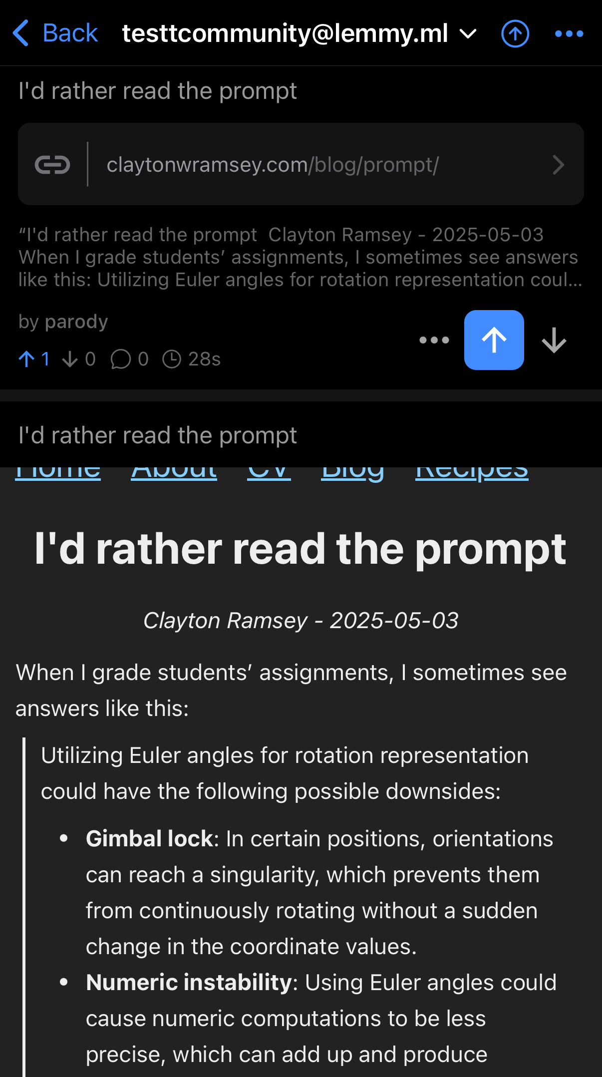
What feature? A toggle to enable first page / viewport screenshots of all linked articles; tap screenshot to open article.
The text preview seen at the top of my test screenshot does NOT do the article justice in my eyes, whereas the screenshot + link is almost everything I want. Lemmy is better for me like this but I’m ready to be convinced otherwise.
(I am cognizant of the fact screenshots are not the most accessible, which is why I pair them with alt text.)
May I ask for further feedback from you / your eight(+) upvoters on the specific negatives with my presentation / my idea?
Maybe…:
I dislike the extra tap required to read the first handful of lines whereas y’all dislike the extra tap required to read the entire thing? 🤷♂️
Could be worse for some apps or if someone’s using RSS…
Oh and I should at least be marking that there’s more to read so folks don’t think the whole point is ONLY the screenshot.
Thank you Grimy!