How to Choose a Color Scheme for Your Entire Home (That Won’t Date Quickly)
Color is the quiet narrator of a home. It sets expectations at the front door, nudges people toward conversation in the living room, settles the mind in bedrooms, and coaxes appetite in a kitchen. When it is cohesive, you notice the comfort, not the paint. When it is rushed or overly trendy, you notice only the missteps. After years of walking clients through whole-home remodels and refreshes, I have a few rules and plenty of field notes about how to build a color scheme that feels timeless without feeling bland.
Start with what is fixed and costly
Before you pick a single paint swatch, look at what you are not changing for the next ten years. Floors, countertops, stone fireplaces, tile, roof lines that affect natural light, large rugs, the undertone of brick or siding on the exterior, and existing trim species all carry weight. Every one of these elements has undertones that will either harmonize with your paint or fight it.
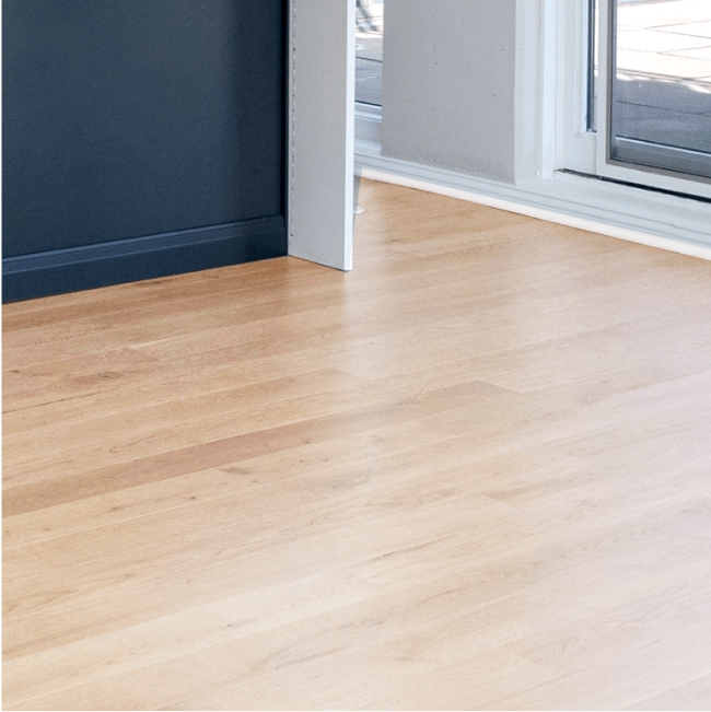
In a 1920s bungalow with original red oak floors, for instance, that subtle amber cast can make a cool gray look icy and tired. Choose a balanced warm neutral, something with a soft beige or greige base, and the floors glow instead of clash. If you plan to refinish hardwoods, decide on the stain color early. Hardwood floor finishes, whether matte, satin, or glossy, change color perception. A matte, natural finish reads more Scandinavian and pairs well with desaturated, earthier walls. A satin espresso finish absorbs light and needs contrast through lighter walls and crisp white trim.
Tile is another undertone trap. Porcelain and ceramic often carry green, pink, or yellow base notes that do not announce themselves until you roll your first coat. Lay swatches directly on the tile and look at them morning, noon, and evening. If you are torn between porcelain and ceramic tile, the choice should consider both durability and color stability across rooms, especially in bathrooms where different tiles meet baseboards and door casings.
Choose a backbone neutral, not six
A cohesive home almost always starts with a backbone neutral that touches most common areas. This is not a white box approach. It is the scaffolding that lets accents and finishes vary without chaos. The color should be chameleon-like, shifting slightly in different light but holding a calm, quiet center.
The most durable backbones live in the middle of the white to beige to greige spectrum. A soft, low-chroma neutral that has nuanced undertones reads sophisticated in daylight and lamplight. If you cannot decide, test three swatches in the same family, each a half step apart. Paint a 2 by 3 foot rectangle on three walls per room, then leave them for a week. Turn on every light you own and watch what happens at night. Lighting design matters. The layering of ambient, task, and accent lighting changes the paint from morning milk to evening honey. Color temperature of bulbs matters too. Warmer bulbs make beige bloom. Cooler bulbs flatten blue undertones.
If your trim is bright white, ensure your backbone neutral has enough depth so the white reads intentional. If your trim is cream or the older, slightly yellowed enamel so common in vintage houses, pick a neutral that leans a touch warm so the contrast feels comfortable, not dingy.
The 60-30-10 rule, adapted for real life
Designers often mention the 60-30-10 rule: 60 percent dominant color, 30 percent secondary, 10 percent accent. In practice, homes do not divide perfectly. Instead, think in zones of dominance: main walls and ceilings do the 60 percent work, large upholstery and cabinets often carry the 30 percent, and accents can rotate seasonally.
To keep things timeless, allow that 10 percent to be the trend zone. In 2025, Chicago home remodeling trends suggest saturated olives, muddy blues, and browned terracottas are having a moment. They look fantastic in powder rooms, on a single built-in, or across textiles. Put those tones on pillows and artwork, not on every wall of your main floor. When tastes change, you want to edit accessories, not repaint 1,800 square feet.
Build a palette from materials, not just paint chips
In whole-home projects I have managed, the most successful palettes start with a tray, not a fan deck. We load it with wood samples, tile pieces, fabric swatches, metal finishes, and a few paint cards. Spread it out in the kitchen where you have the best light. You will immediately see which metals fight each other, which fabrics pull green out of a neutral, and which backsplash choices strain the whole composition.
Quartz and natural stone deserve careful attention. A marble with bold gray veining will push you toward cooler cabinetry and wall colors unless you counter with a warmer floor and brass hardware. On the flip side, a creamy quartz with soft beige flecks supports warm whites and natural oak. The best backsplash materials for easy cleaning, like glazed ceramic or large-format porcelain, also reflect light differently. Glossy tile will slightly brighten and cool the wall color around it, which is useful in small kitchens, while matte tile absorbs and softens light.
Where to go bold, and where to stay restrained
Large, expensive surfaces should stay quiet. This includes kitchen cabinets, major tile runs, and extensive trim packages. Colorful cabinets are beautiful on Instagram, but the half-life of saturated kitchens can be short. If you love color in the kitchen, place it on a freestanding island or in a butler’s pantry, or use two-tone kitchen cabinets with a more grounded, neutral on the perimeter and a richer tone on the island. That creates interest without boxing you into an era.
Small rooms love big color. Powder rooms, studies, and guest rooms are perfect for deep teals, aubergines, or inks. A Jack and Jill bathroom can support playful color on vanity bases because the footprint is contained. Bedrooms deserve restraint, not because they must be boring, but because rest benefits from low contrast. Use texture and subtle contrast instead of high saturation. A soft green-gray on walls, creamy linens, and sand-colored wool rugs calm the space better than one heroic accent wall.
Undertones, metamerism, and why your perfect paint turned wrong
Two colors can match in one room and diverge in another because of metamerism. That is the phenomenon where colors change appearance under different lighting spectra. LED bulbs vary, cloudy days in Chicago pull daylight cooler, and north-facing rooms mute colors more than south-facing ones. It is why that gray-beige that looked elegant at the paint store turned violet in your den.
Combat this with deliberate sampling. Paint at least three sample squares on the same wall and one on a perpendicular wall. Include a true white and a known warm neutral as controls, so your eyes have a reference. Live with the samples for a few overcast days and a sunny day, then check at night with every fixture on. https://www.reviverenovations.com/ This testing costs maybe 50 dollars in sample pots and saves a thousand in repaints.
How trim, doors, and ceilings tie the house together
Trim is the unifying ribbon that runs through a home. You can vary wall color by zone, but when baseboards change color mid-hall, cohesion dies. Pick one trim color and stick with it across rooms. In historic homes, a slightly creamy white often feels authentic. In newer builds, a crisper white provides the right edge against modern fixtures. If your home spans multiple eras through past additions, choose a trim white that is neutral on the warm-cool spectrum, then adjust wall colors by wing.
Doors can be an opportunity for subtle drama. A soft charcoal interior door in a light-walled home adds depth, especially if your floors are light. It anchors the palette without dominating. Ceilings are rarely pure white in older Chicago homes with plaster. A 10 to 20 percent tint of your wall color can bring ceilings down visually in tall rooms and eliminate that cut-line glare you see with stark white. For lower ceilings, stick to a light, untinted ceiling white to keep height.
Case notes from the field: how Revive 360 Renovations frames whole-home palettes
When we develop a color plan for an entire house at Revive 360 Renovations, we begin with a walk-through and a lighting audit. We note window exposures, the presence of mature trees, and ceiling heights, then we map how daylight actually moves through the home. We bring a kit with dimmable bulbs in multiple color temperatures because a client’s current lamps can distort perception. Then we lay out a material board with what is fixed or already purchased, followed by a neutral backbone candidate and two alternates. We do this because choosing a color scheme is closer to editing a story than picking a single hue. The sentences need rhythm and punctuation between rooms, not just one tone.
On a recent Tudor with leaded windows and rich wood beams, the owners wanted to modernize without erasing character. We kept the beams and doors in a medium walnut, chose a warm gray on walls that held its shape under low winter light, and reserved saturated greens for the library. The kitchen stayed soft and creamy with subtle contrast on the island. Six months later, they could not recall any single paint name because the house felt quietly aligned. That is the goal.
A palette that respects seasons, especially in Chicago
Weather shifts affect color mood more than most people realize. In Chicago, long gray winters test cool palettes. A home full of blue grays can feel chilly by February. If you prefer cool tones, layer warmth through textiles and wood species. Oak butcher block on a prep table, rattan accents, and wool throws keep the cool paint from feeling clinical.
Summer light is harsher and higher. Whites can glare. A backbone neutral with a touch of warmth keeps your rooms from going chalky. The best time of year to remodel your home in Chicago often aligns with spring and summer because of permit timelines and lead times for trades, but that also means your sampling happens in bright light. Re-test once fall arrives before signing off on the full house. A timeless scheme survives season to season without constant tweaking.
How many colors is too many?
I like a range of five to seven paints for a whole house including trim and ceilings. That includes your backbone neutral, one quieter secondary neutral, one or two accent colors for smaller rooms, the trim white, the ceiling white or tint, and perhaps a cabinet color. More than that and you spend your energy managing transitions. Fewer than that risks monotony unless your materials do the heavy lifting.
Every transition should be planned. When the living room meets the hallway, do you turn the corner with the same color, or does trim create a natural break for a shift? Align color changes with door casings whenever possible. If open concept spaces flow into each other, keep the walls consistent and use millwork, furniture, and textiles to signal zones. This respects the open concept vs. traditional layouts conversation: color becomes the tool that organizes without putting walls back.
Kitchens and bathrooms carry special rules
In kitchens, cabinet and countertop colors should lead the decision. Once those are chosen, match the wall color to the least assertive undertone. If quartz carries a faint taupe, follow it with a soft greige on walls so the room reads unified. Avoid strong wall colors that compete with backsplash patterns. If you want a bold gesture, try a deep navy or green on a small bank of cabinets or a walk-in pantry. For a family-friendly kitchen that will age gracefully, keep perimeter cabinetry lighter and invest in excellent lighting and hardware that last.
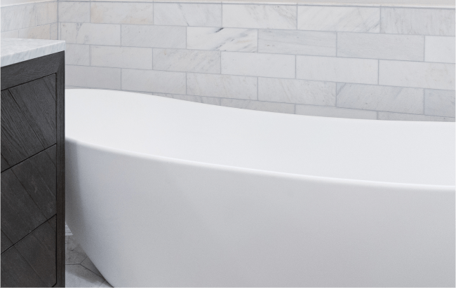
Bathrooms need moisture-resistant logic as well as beauty. Tiles age better when they are neutral, since you may change faucets and mirrors more often. If you crave pattern, put it on the floor in a material that is durable and easy to clean. Shower tile in a timeless field, like white or cream with interest in shape, pairs better with varied towels over the years. Grout color matters. A mid-tone grout hides mildew and hard water marks better than very light or very dark, and the grout can nudge the palette warm or cool.
Bedrooms, nurseries, and multi-generational spaces
Bedrooms deserve personal color, but the larger the suite, the more it benefits from nuance over punch. Primary suites with sitting areas work well with a single, serene wall color and varied textiles. In children’s rooms, choose grown-up wall colors and let decor bring the whimsy. That saves you a repaint every two years. For multi-generational homes, where grandparents, parents, and kids share spaces, aim for a palette with a stable core but allow a deeper or softer alternate neutral in private wings. Universal design touches, like higher contrast between baseboards and floors for visual clarity, also guide color choices.
Levers that extend the life of your palette
If you want a scheme that will not date quickly, build flexibility into the elements that are easiest to switch. Upholstery slipcovers, throw pillows, art, and window treatments should be the style levers. Paint is easier to change than tile, but it is still a whole-house effort. Keep the most expensive surfaces and the most visible expanses in quiet, classic territory. Trends can visit through the 10 percent zone.
Smart home technology integration can help you experiment. Tunable white fixtures allow you to adjust color temperature across the day. That lets a warm neutral hold up during meal prep and cool slightly for focus at a home office desk. In remodels where clients are hesitant about perceived paint warmth, we have used tunable lighting to keep the space versatile. It is not a gimmick. It is a tool to keep color honest under different lighting demands.
The budget reality, and where to spend
People often ask how to plan a home renovation on a budget while still getting a cohesive palette. Spend money on prep and sheen selection. A high-quality, washable matte or eggshell on walls will look better longer than a cheaper paint that burnishes or scuffs. Semi-gloss on trim is a classic, but in homes with older trim work that has seen better days, a satin hides sins while staying cleanable.
Sampling is the other budget hero. A 50 to 100 dollar sampling phase can prevent thousands in repainting or material changes. Do not shortcut it. If you plan a remodel timeline, add a week for color testing after major materials arrive. How to create a remodeling timeline that works includes staging color after flooring is installed and before fixtures go in, so you are not picking in a vacuum.
What a color consultation should cover
When homeowners sit down for a home remodeling consultation, they expect to flip through fan decks. A good session goes further. It should cover the psychological needs of each room, the variety of daylight exposures, how furniture scale and finishes will interact, and the maintenance realities of busy zones. It should include a quick lesson on undertones so you can read them yourself. If you are evaluating how to hire the right contractor for your remodeling project, ask how they stage color decisions alongside permits, demo, and rough-ins. Experienced teams factor color into material lead times, not as an afterthought.
How Revive 360 Renovations handles tricky edge cases
We often field projects where owners want to mix modern and traditional styles in their renovation. Color is the bridge. In a century-old two-flat converted to a single-family, we kept the heritage by choosing a warm, subtly complex white for the plaster walls and a slightly deeper greige for paneled millwork. Then we introduced modern notes with graphite interior doors and matte black hardware. The palette held everything together, so the sleek kitchen and the vintage banister belonged to the same story.
Another common edge case is low natural light. How to maximize natural light in your home renovation usually starts with the obvious - add glass, rethink window treatments, use reflective finishes - but color can help. In dim rooms, mid-tone colors often do better than very light ones, which can go gray and dingy without enough daylight. We have tinted ceilings slightly to match walls and eliminated high contrast so light bounces more evenly. Layered lighting finishes the job.
A third edge case is unifying different flooring types. Maybe you have tile in the kitchen, oak down the hall, carpet in bedrooms. How to transition between different flooring types is a design question, but color smooths it. Choose a wall color that plays with the dominant undertone of each floor so the shifts feel deliberate. If you plan to match flooring throughout your home during a phased remodel, anchor the palette to the target floor tone early so you avoid repainting across phases.
Exterior to interior: carry a thread through the threshold
If you can, take a hint from your exterior. Brick’s warmth or coolness, the roof color, and your front door finish all set expectations. A deep green door often points to a warm neutral interior. A charcoal or blue-black door suggests cooler, crisper lines inside. You do not need to match, but a thread helps. Carry the front door color to a mudroom bench or a built-in in the back hall. Mudroom design that respects Chicago weather needs durable finishes anyway, so a darker, wipeable paint on built-ins makes practical sense and ties to the exterior story.
Hardware, metals, and woods: do they need to match?
No, but they should relate. Aim for two families of metal across the home, not five. If you love brass and black, lean in and repeat them. Use brushed rather than polished finishes for longevity. Hardware that lasts is about finish quality and patina tolerance. Brass ages well in traditional settings. Black hardware sits quietly in modern spaces. Chrome and nickel feel crisp but can swing cold, so warm up the surrounding palette accordingly.
For woods, do not chase a perfect match. Vary species and stains with intention. A walnut dining table next to white oak floors looks rich when your wall color supports both. The right floor stain color and wide-plank choices can shift the palette from rustic to refined. If pets live in the house, consider the best flooring options for pet owners before finalizing wall colors. Dark floors show dust and fur, which affects how often you want to see contrast against baseboards.
The paint finish matters as much as the color
Textured vs. smooth paint finishes change the read of color. Matte absorbs light and softens color, great for living rooms and bedrooms. Eggshell adds durability for hallways. Satin or semi-gloss on trim gives that crisp line against walls. In humid bathrooms, high-quality satin on walls resists moisture, while a dedicated bath primer prevents mildew. Speaking of primers, the best primer for different painting surfaces can change final hue. Over new drywall, a white primer brightens. Over stained trim, a shellac-based primer blocks bleed, safeguarding that true white you chose.
A compact checklist for building a timeless whole-home palette
Identify all fixed materials and their undertones, then sample paint against them. Select one backbone neutral that works in at least three different rooms and exposures. Plan 1 to 2 accent colors for smaller spaces, and keep large surfaces calm. Choose one trim color and stick with it throughout the home. Test samples under multiple lights and at different times of day, and finalize only after lighting is dialed.
What dates quickly, and what endures
Trends come in waves. Over the past decade we saw cool grays peak, then swing back toward warmer neutrals and complex beiges. Wallpaper is back, but in more restrained, textured forms. Two-tone kitchens still work when the contrast is softened. What dates quickly are extremes: very cool grays without warmth, hyper-saturated cabinet colors on every surface, high-contrast accent walls in every room, and finishes that shout.
What endures is balance. Colors with mixed undertones, woods with visible grain, stones with soft movement rather than aggressive veining, and whites that are not stark or creamy but somewhere in between. Paint that nods to context, not era, will keep your home handsome even as the calendar rolls on.
Before and after: the quiet transformation
One of my favorite transformations involved a brick three-flat turned single-family. The before photos show four different whites on trim, patchy gray walls, and a kitchen in glossy navy that looked dated after two years. We rebuilt the palette with a warm greige that carried through hallways and open rooms, a richer clay green in the dining room to play with the brick, and a deep, ink blue only on the island. Trim went to a consistent neutral white. The before and after felt dramatic, yet the color names did not matter. The house simply felt coherent, calm, and alive with natural light.
Integrating color decisions with the rest of your remodel
Color lives at the intersection of design and construction. Permits and regulations for home renovations in Chicago will not specify your palette, but their timelines affect when you choose it. Plan color after major structural choices and before finish orders close. If you are living through a remodel, minimize disruption by sequencing painting to happen after the dustiest trades are done but before fixtures and hardware go in. Protect your belongings during a home renovation with proper masking and sealed storage, especially if you are spraying trim.
If you are working with a local team, the benefits of hiring a local Chicago remodeling company show up in color too. Locals understand our light, our winters, and how colors age in real Midwestern homes with snow gear, radiators, and long shoulder seasons. Revive 360 Renovations often coordinates with painters, cabinet makers, and lighting suppliers early, so the palette is baked into the schedule and the budget with no surprises. The hidden costs of home remodeling frequently pop when color is left to the last minute and materials need to be returned or repainted. An integrated process avoids that.
When to break the rules
Every rule here has context. I have seen a sun drenched, south-facing loft carry an all-white palette masterfully, because texture and scale did the rest. I have seen a windowless den painted in a saturated oxblood that became the most-loved room in a house. The difference between renovation and remodeling matters less to color than the intention you bring to it. Renovation often preserves more of the original materials and undertones, which your palette should respect. Remodeling allows a fresh start across more surfaces, which means you can shift the undertone family entirely if you wish.
If you want to experiment without fear, try it in spaces you can repaint in a day. A small powder room, a back hall, or a home office. Creating a home office that boosts productivity can benefit from a deeper, soothed color that helps you focus. When you see how that color behaves across seasons, you will know whether to expand it elsewhere.
What Revive 360 Renovations watches for at the final walk-through
Before we sign off on a color-driven project, we check sight lines. From the front door, do you glimpse colors that relate? Does the upstairs hall borrow nicely from the stairwell? Are the bathroom doors closed in a way that hides abrupt transitions? We tweak bulb temperatures, adjust dimmer profiles, and make sure the paint finish suits traffic realities. If a family has pets and toddlers, we may quietly shift the stairwell to a more scrubable finish. If an accent color on a built-in feels a hair strong after hardware goes on, we adjust to the next swatch down the strip.
We also leave clients with a simple maintenance guide: which paints were used where, sheen notes, and how to touch up. Good palettes age well when they are cared for.
A last word on confidence
Choosing a color scheme for your entire home is less about memorizing paint names and more about learning to read light, undertones, and materials. When you set a calm backbone, respect what is fixed, and give yourself a flexible 10 percent for trends, your home will avoid the quick fade of a dated palette. It will feel collected rather than executed, the way the best homes do.
If you are still unsure, bring your tray of samples to a sunlit table and invite a second set of eyes. A neighbor who knows your light. A contractor who has painted a hundred homes. Or a design-build team like Revive 360 Renovations, who has learned, project by project, that color is a craft as much as it is a choice.